People with literacy challenges are “left behind” in disaster communication


The UN Sustainable Development Goals commit to “leave no one behind!” However, the illiterate, functionally illiterate, and situationally-illiterate are highly marginalized. There is very little or no addressing of inclusive disaster communication.
The uptake of pictographs in disaster communication is very premature. Current research is inadequate to develop any semantics or a framework to support their use for linguistically challenged.
The overall finding is that the obvious was not obvious with currently available disaster symbols.
The Real Need
We realised the need for developing an alternative to text-based disaster communication back in 2013, to foster “inclusive disaster information communication”. There are people with learning and comprehension disabilities like the dyslexic and elderly. Numeracy and the talent to actually understand and make use of the things read, also fall into the scope of illiteracy for those without these skills. Foreigners who can read and write but don’t speak the native language are marginalized and are functionally illiterate. In emergency and traumatic situations, written language comprehension can become challenging. Such functionally-illiterate circumstances can be regarded as a situational occurrence of functional illiteracy.
Background
Elizabeth Klute field tested pictographs for communicating tsunami warnings in the Caribbean. The Guemil project also surveyed the comprehension and appropriateness of using symbols to assist with emergency situations in Chile. Chinese scholars had examined the use of icons with maps for improving the perception of danger. The US Homeland Security point symbols and mapping standards were also developed for a similar purpose of swiftly projecting the various geographical threats.
Most approaches were using symbology for downstream communication of incident alerts and warnings; mainly by authorities. The ExCites Lab, with their Sapelli mobile app, was one project we interacted with, who were using pictographs for villages to make upstream reports to authorities e.g. of illicit poaching and logging incidents. Others like Microsoft Research India have used pictograph-based GUI design with low-literate communities for last-mile communities to share information upstream, but not in the context of disaster or emergency communication.
Recognition Phase Research
We were keen to make use of the ubiquitous mobile technology, for sending and receiving disaster information. The recognition phase set out to reach a thorough understanding of the challenge of pictographic disaster communication to accomplish the specific objectives of answering the following questions:
- What kind of pictographs adequately represent risk information?
- How to effectively communicate risk information using mobile screens?
- What is the scope and utility of pictographs in risk information communication?
Summary of the Findings
The early interactions with the disaster experts revealed that
- Numbers that are generally in a typical message (e.g. time, rainfall, flood height) were not converted to pictographs
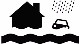
- Reference objects worked well such as using houses to indicate the flood height or drawing multiple people to indicate a group
- Hazard events (e.g. a cliff and falling rocks for landslide) were well depicted, but they often didn’t indicate the instructions or required response action
We first made use of existing icons that were taken, mainly, from the Noun Project, which includes the 500 humanitarian symbols developed by the United Nations Office for the Coordination of Humanitarian Affairs. The symbols were presented to community participants from the:
- Sarvodaya villages in Colombo and Ratnapura in Sri Lanka and
- Deaf Disaster Assistance Team - Disaster Risk Reduction in Cebu, Philippines
We asked them to identify, categorize and associate the icon sets with a scenario (or hazard event). We discuss the outcomes in “do pictographs need context?” In general:
- Most of the pictographs can be understood but some symbols are lacking (e.g. heavy rains) and the symbol for cyclone was impossible to comprehend
- If a pictograph shows context it is more likely to be used for their reporting needs
- Response actions were the most difficult to represent; thus, differentiating between observing an emerging threat versus evacuating
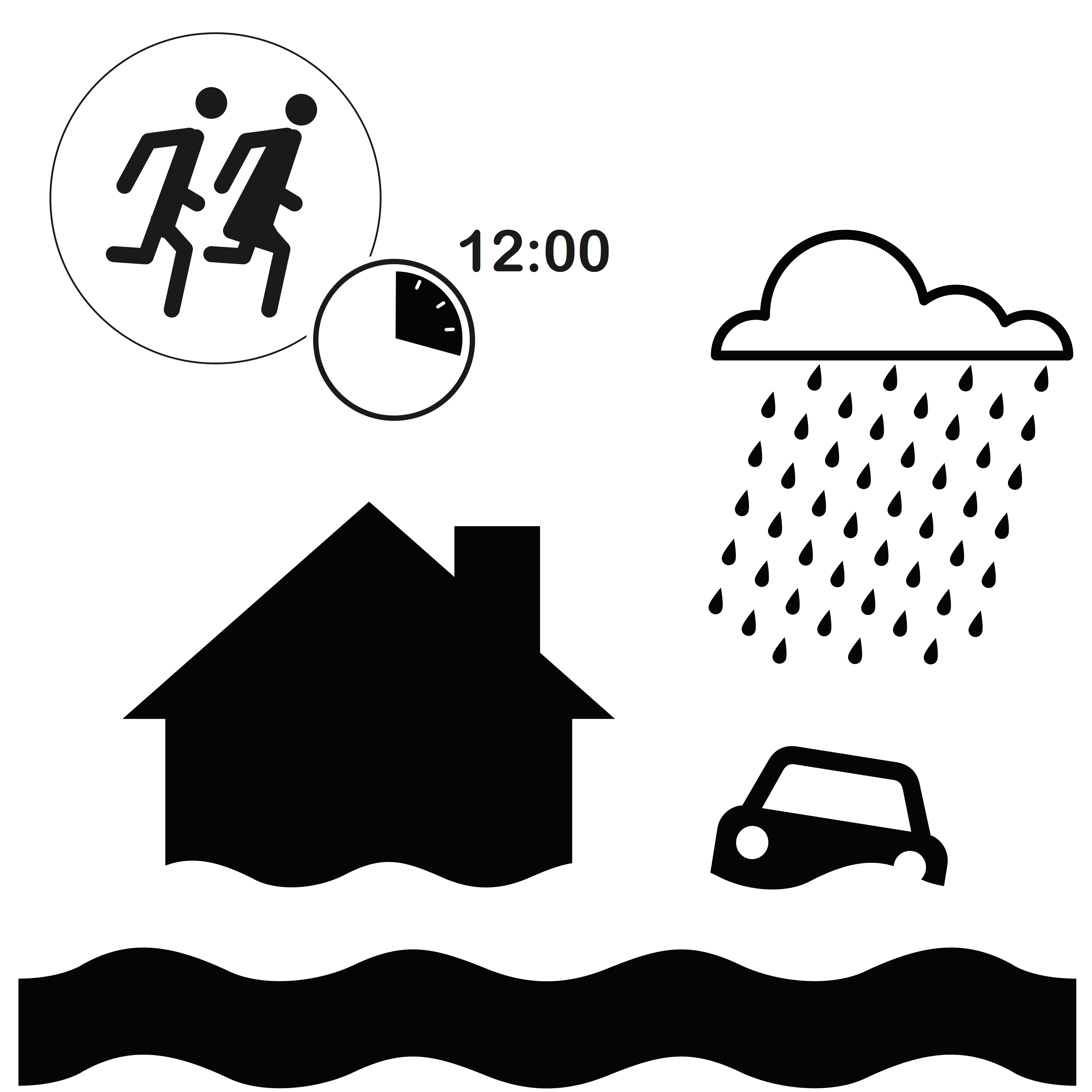
We developed a set of pictograph variations for a flood event. Thereafter, we field tested the variations to determine the comprehension and appropriateness factors:
- Alerting - response actions, response time (or urgency), and severity
- Reporting - severity, immediate needs, and quantities
The results presented a mixed opinion for the different groups. We were able to confirm that:
- Adding context improves the comprehension but comprehension of the incident reduces when response action is introduced
- Severity and time are not well understood and need to be researched further; they are important pieces of information.
- Choice of immediate need whether to remain observant, prepare, or evacuate was understood; with using the term families over people to indicate the affected numbers in the reporting activities
Some of these results were presented at the:
- CAP Implementation Workshop in Rome, September 2017
- Translating Voice Translating Regions in London, December 2017
- International Journal of Information Systems for Crisis Response and Management, Volume 09 Issue 02, 2018
Follow us on ResearchGate for more literature updates and the project page for future activities.
Stay updated
Sign up for our newsletter to receive regular updates on resources, news, and insights like this. Don’t miss out on important information that can help you stay informed and engaged.


Explore Elrha
Learn more about our mission, the organisations we support, and the resources we provide to drive research and innovation in humanitarian response.