Beyond the flowchart: why cartoons belong in humanitarian communications
9 March 2026
Author
Zainab Umar, Communications Manager (Outreach and Engagement), Elrha
Type
Elrha insights
Area of funding
Humanitarian Research
Focus areas
No items found.
Year
2026
Organisations
No items found.


This piece was authored by our Communications Manager (Outreach and Engagement), Zainab Umar.
Humanitarian communication has a recurring problem: we are asked to explain complicated things to busy people who are already overwhelmed. In international policy and research spaces, you can have a rigorous model, a careful framework, a deftly referenced learning paper, and still watch it fail to land because the format asks too much of a crowded mind at the wrong moment.
Most of us reach for what feels familiar. We rely on photography when we want to convey emotion and urgency. We rely on abstract graphics when we want to convey systems: circles, arrows, stakeholder maps, and neat boxes that promise order. Photos are powerful, but they struggle to show the invisible machinery of decisions. Diagrams can be accurate, but still leave people cold. They don’t always give audiences an image they can hold onto after the session ends. Clarity is not only about tidy design. It is also about framing: what people see first, what they can repeat later, what sticks long enough to influence a decision.
As budgets tighten, the temptation is to opt for faster, cheaper visuals, including AI-generated imagery. The New Humanitarian’s recent piece on AI visuals makes a useful point: the technology will only recycle what we’ve already normalised in the sector’s visual culture, unless we change the underlying habits of representation.
Our learning paper From knowing to doing captures why this matters. Evidence does not move in a straight line. It travels through a mix of actors and routes: brokers and champions, donor requirements, guidelines, training, tools, and the informal exchanges that happen in the margins of meetings. If we keep communicating as if the pathway is linear, we should not be surprised when our outputs fall off the conveyor belt.
This is where cartoons earn their place.
How cartoons can make complex ideas land
Cartoons compress. They turn a complicated dynamic into a single scene that can be understood quickly. They also tell a truth that many of our institutional visuals avoid: they make power, incentives, contradictions and fatigue visible. That is why political cartoons have shaped public debate for centuries. They are not “simple”; they are economical. They invite the reader to interpret, and that invitation often sparks conversation. The Roosevelt Review’s piece on political cartoons is aimed at a general audience, but the lesson transfers neatly to humanitarian communications: cartoons prompt people to pause and analyse, rather than just consume information.
Edward Tufte makes the same case from the world of information design: respect the audience’s intelligence, tell the truth, and design so that truth can be seen. “Simpler” is not the goal; understandable is.
A good cartoon can do that work in seconds.
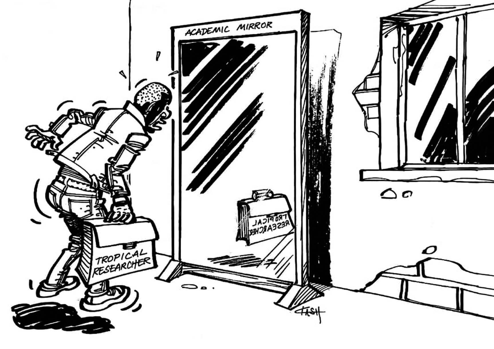
The Bukavu series shows what this looks like at its best. In the online exhibition, Congolese political cartoonist Tembo Kash turns the politics of research partnerships into images that stay with you. The “Academic Mirror” is the one I return to. A Congolese researcher looks into a mirror and finds he has vanished, leaving only his briefcase behind. Data without recognition. Labour without authorship. It is a sharper critique of extractive partnership dynamics than most of the prose we produce about “equity”. And it travels because it gives people a shared reference point. You don’t need a technical background to understand the point, and you don’t need a long attention span to remember it.
For humanitarian communicators, the question is not whether cartoons are “appropriate”. The question is whether we are willing to use a visual style that can carry complexity without flattening it, and critique without requiring a defensive stance.
Cartoons also work when the goal is reach and empathy, not critique. UNHCR’s collaboration with Thai illustrator Wisut ‘Tum’ Ponnimit, which introduced the cartoon character “Mamuang for UNHCR”, is a useful example of how a familiar visual world can open up a difficult conversation with audiences who might never read a briefing note. The point is not the character itself, but the principle: when the visual style fits the audience, the message travels further and lands faster.
Cartoons also work well inside a communications strategy because they create an entry point. They are rarely the whole story, and they shouldn’t be. But they can be the front door: the frame that helps people grasp a concept quickly, and the hook that draws them into the brief, the tool, or the longer read.
.png)
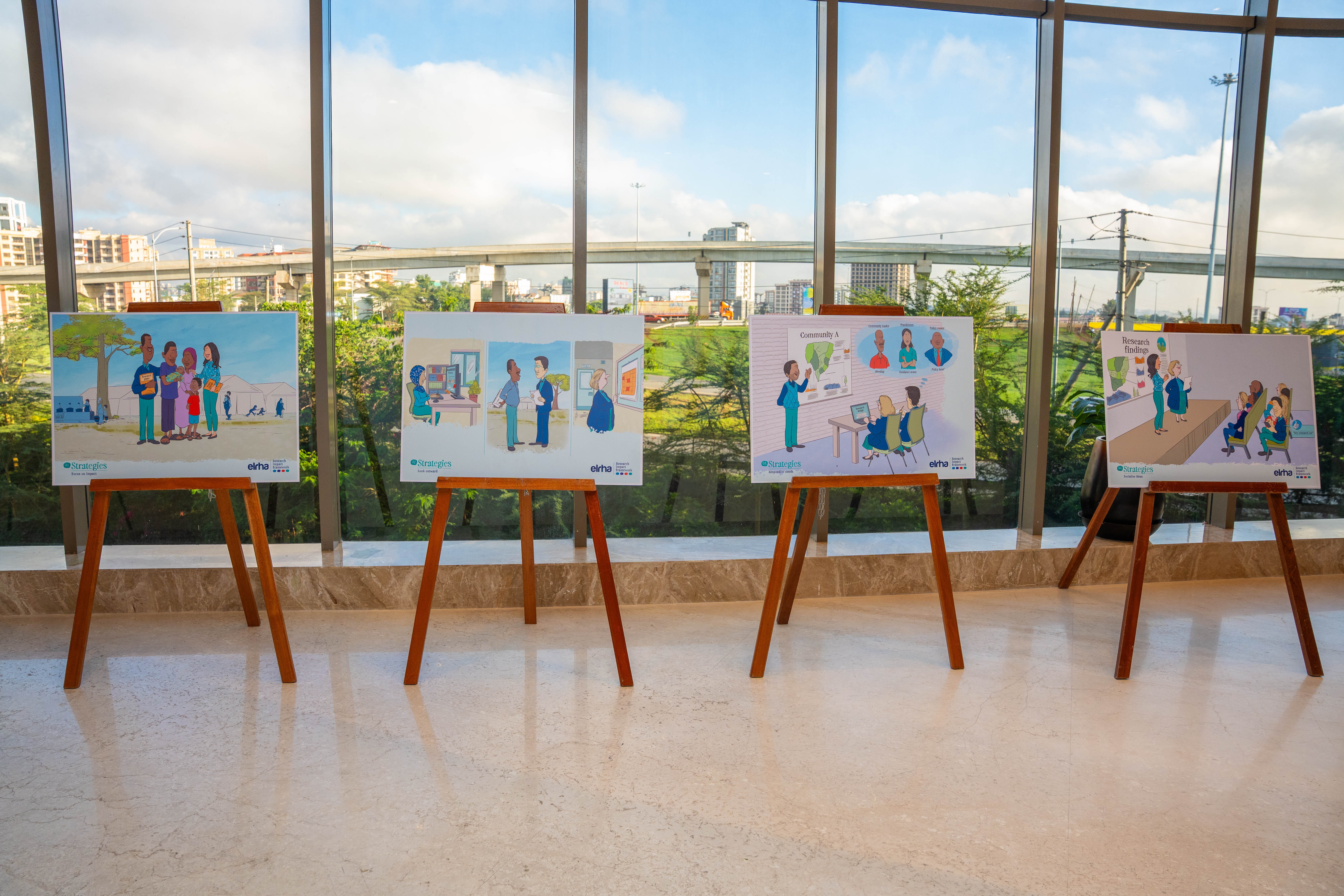
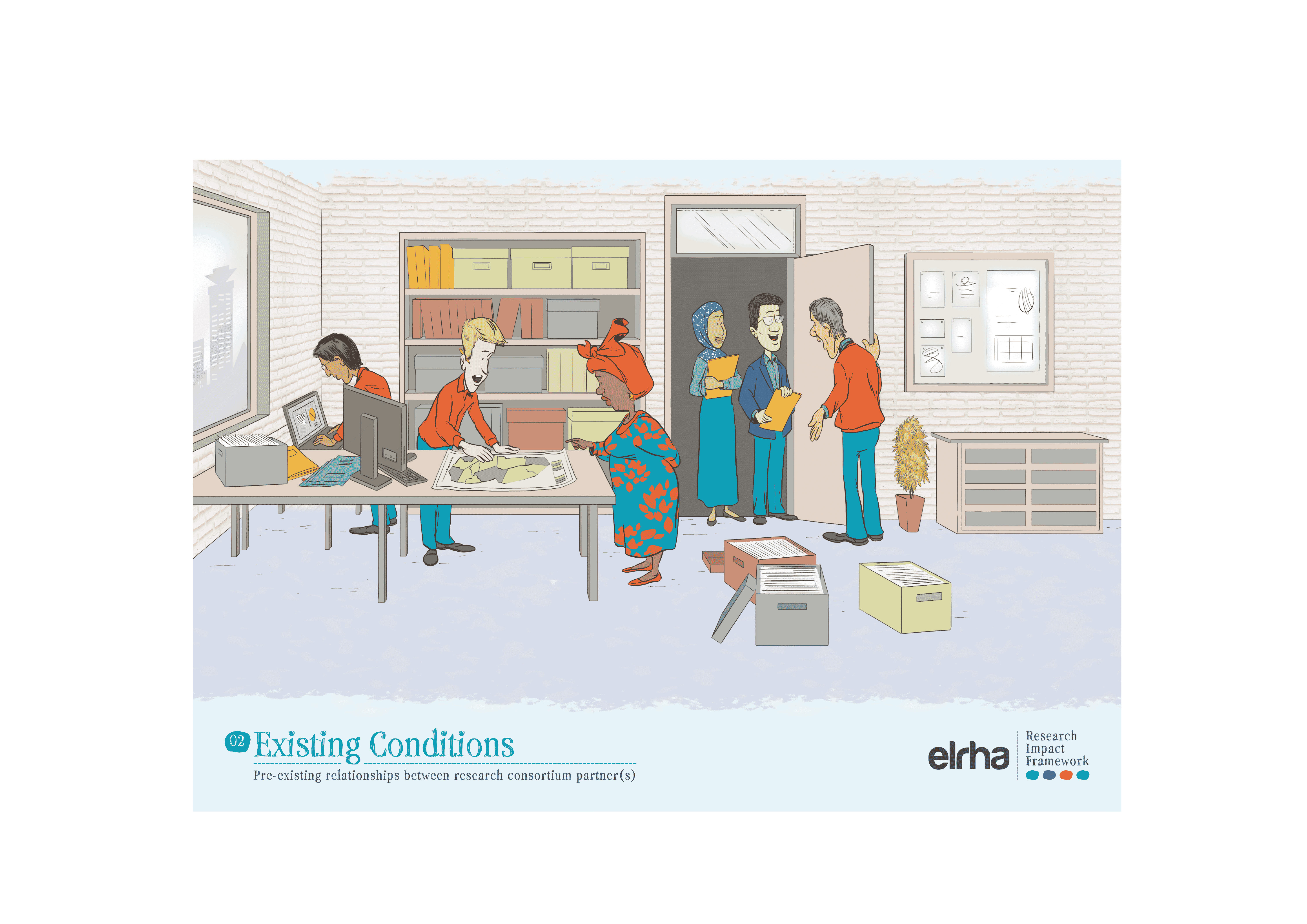
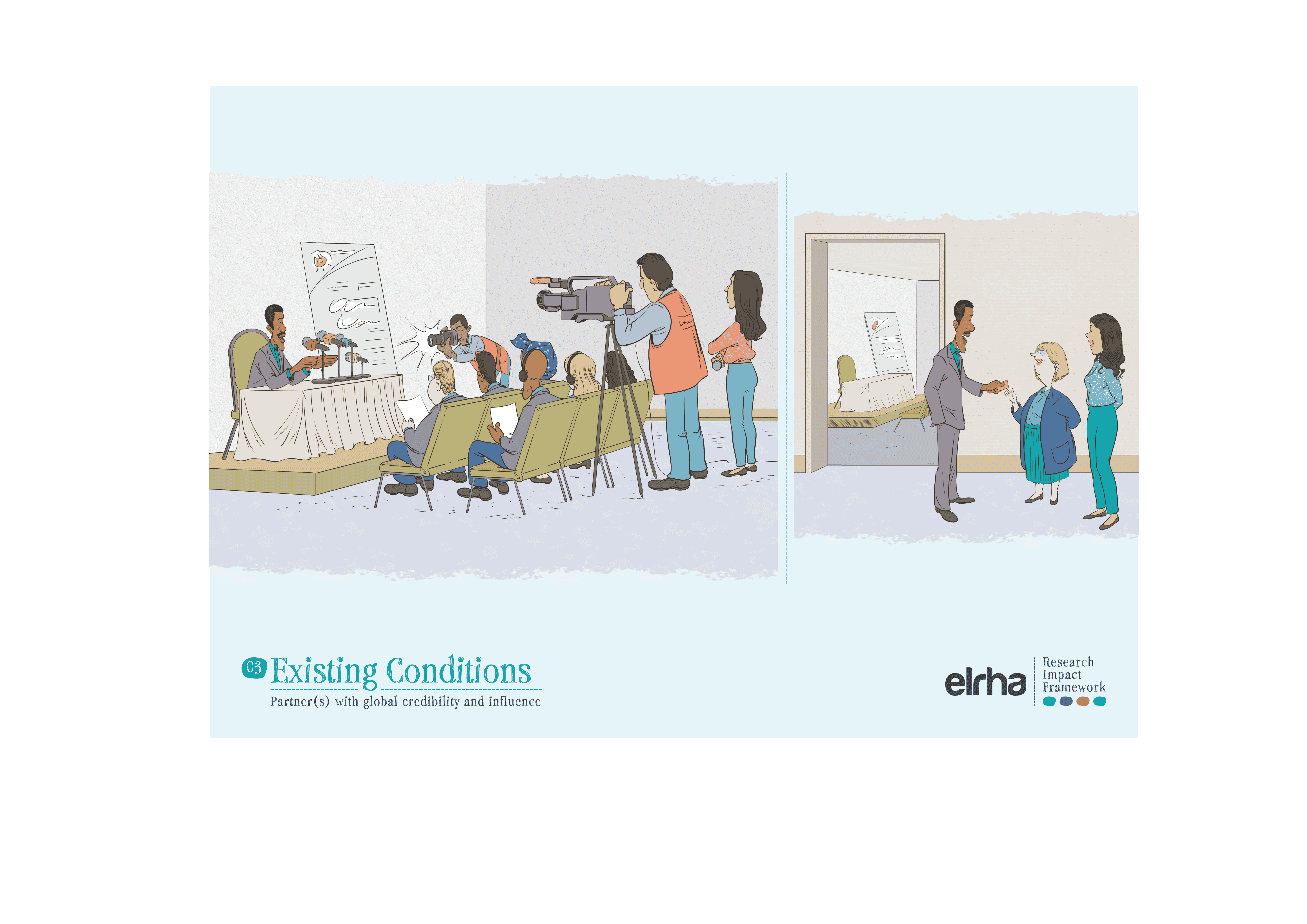
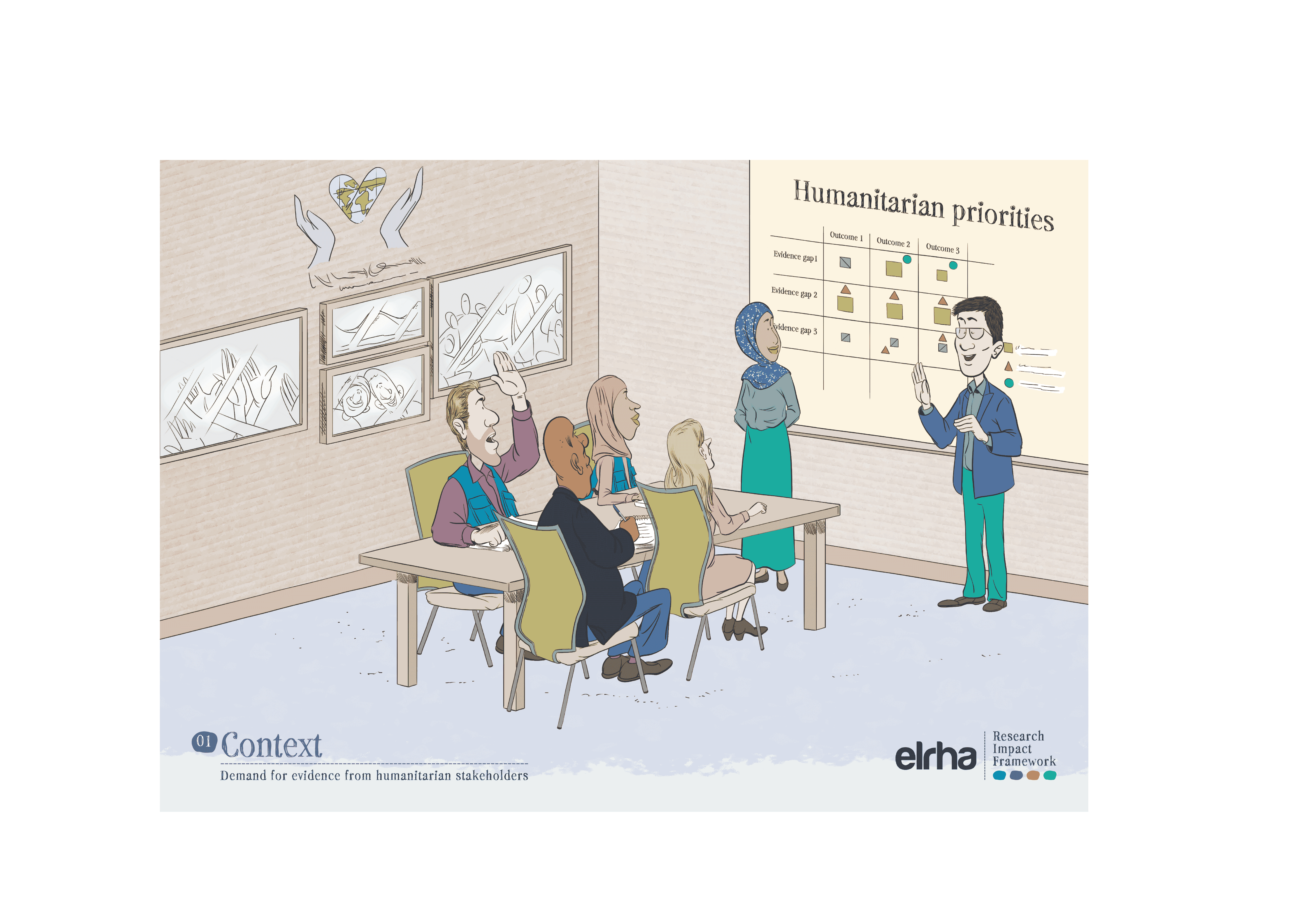
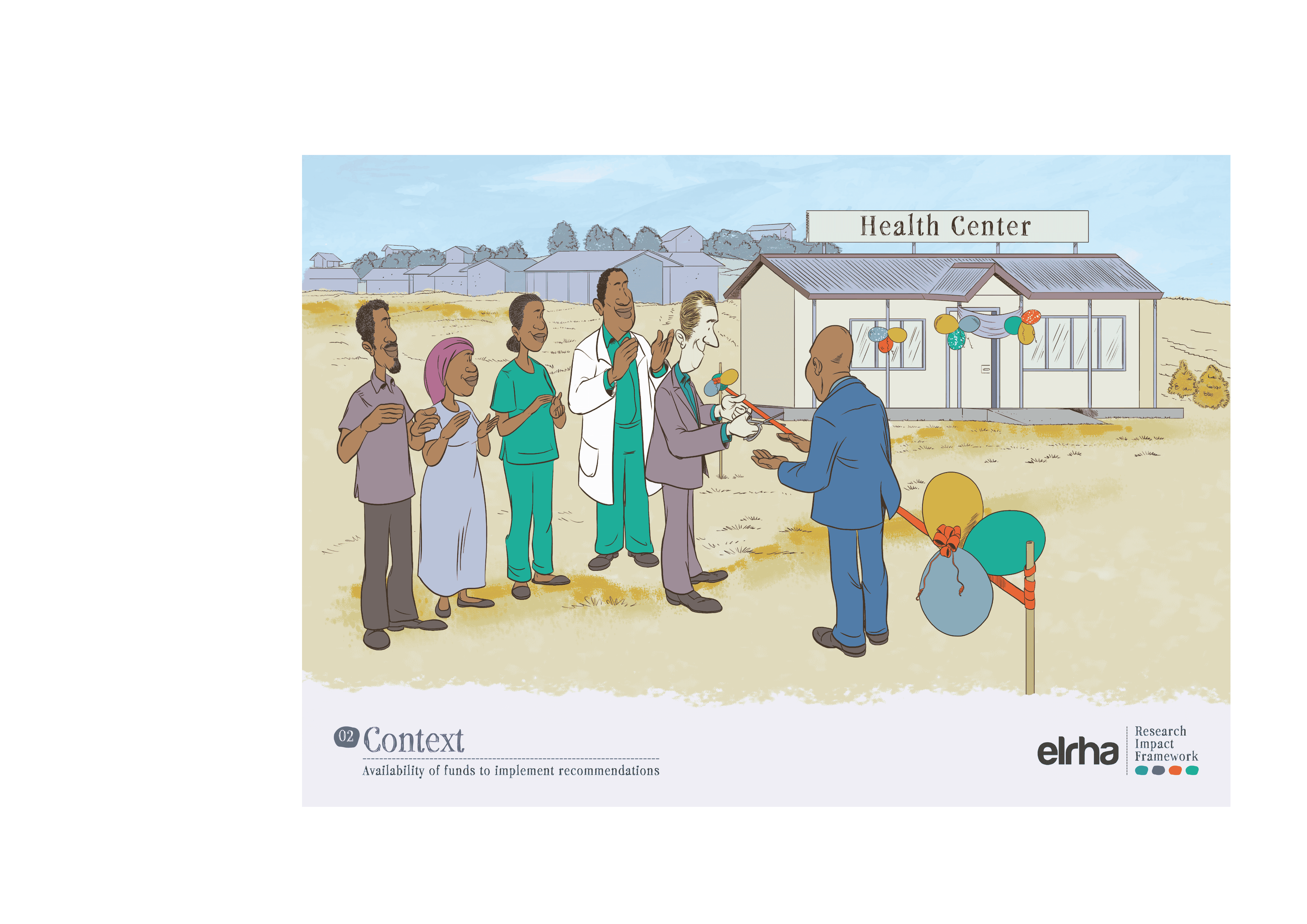
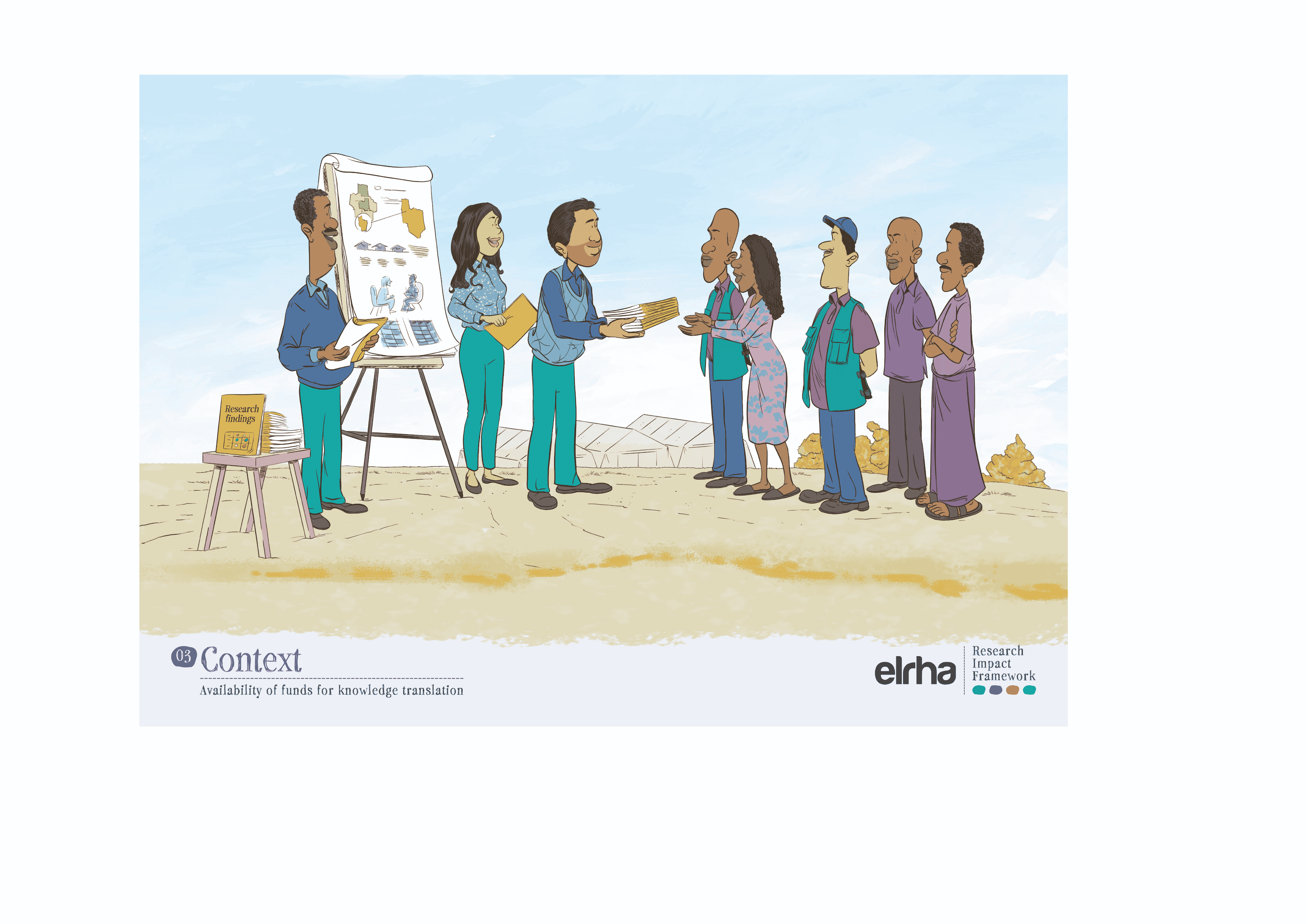
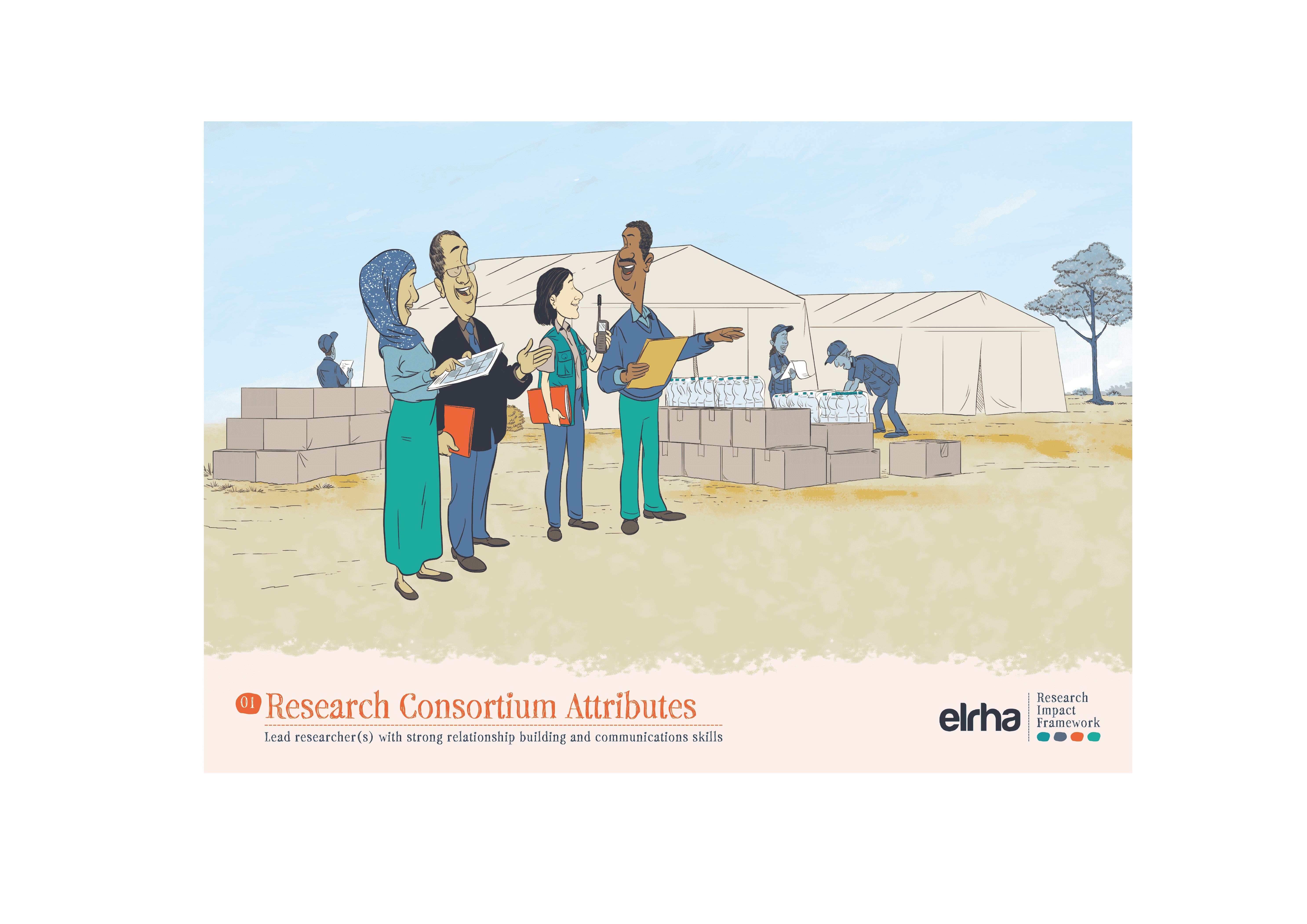
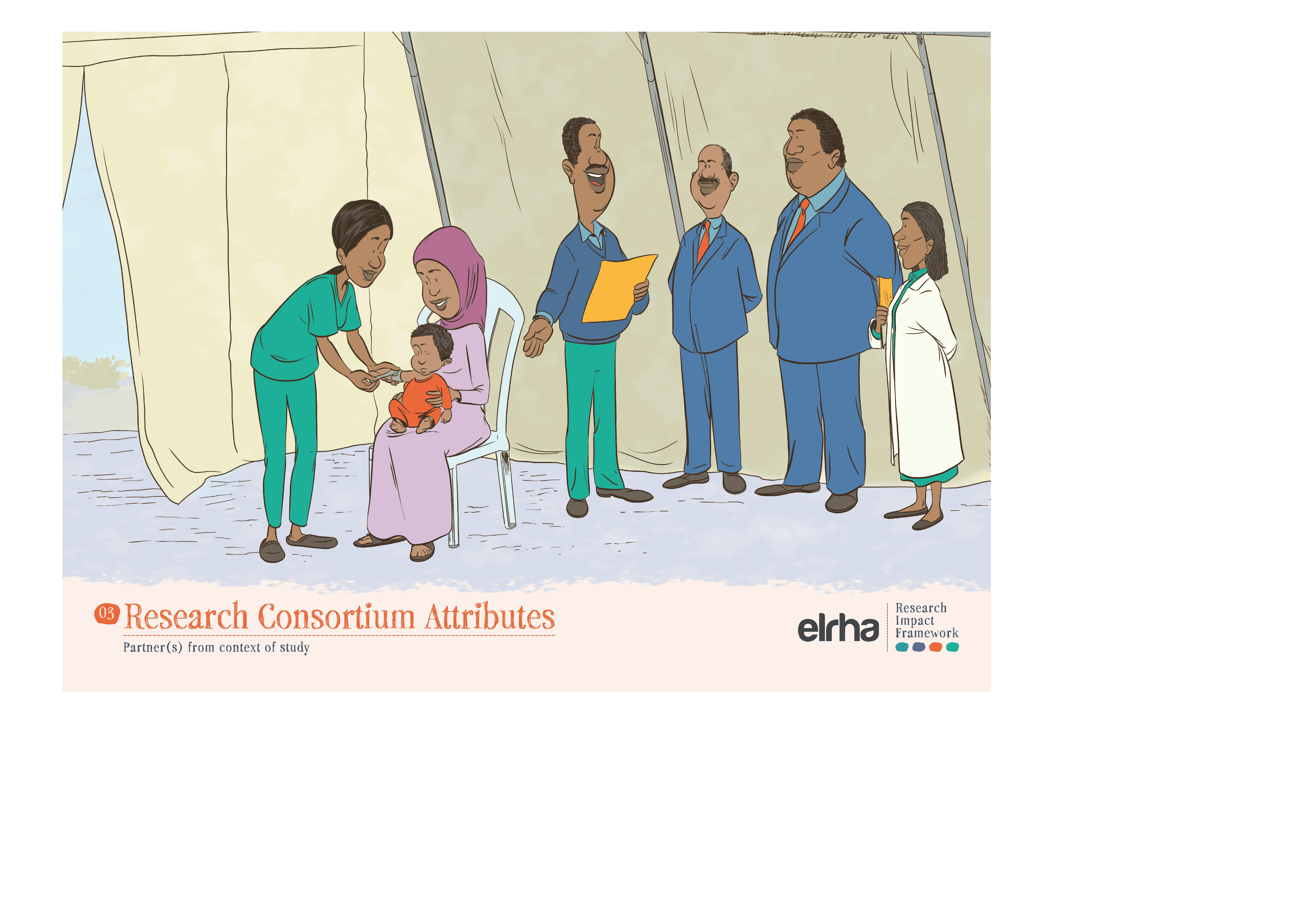
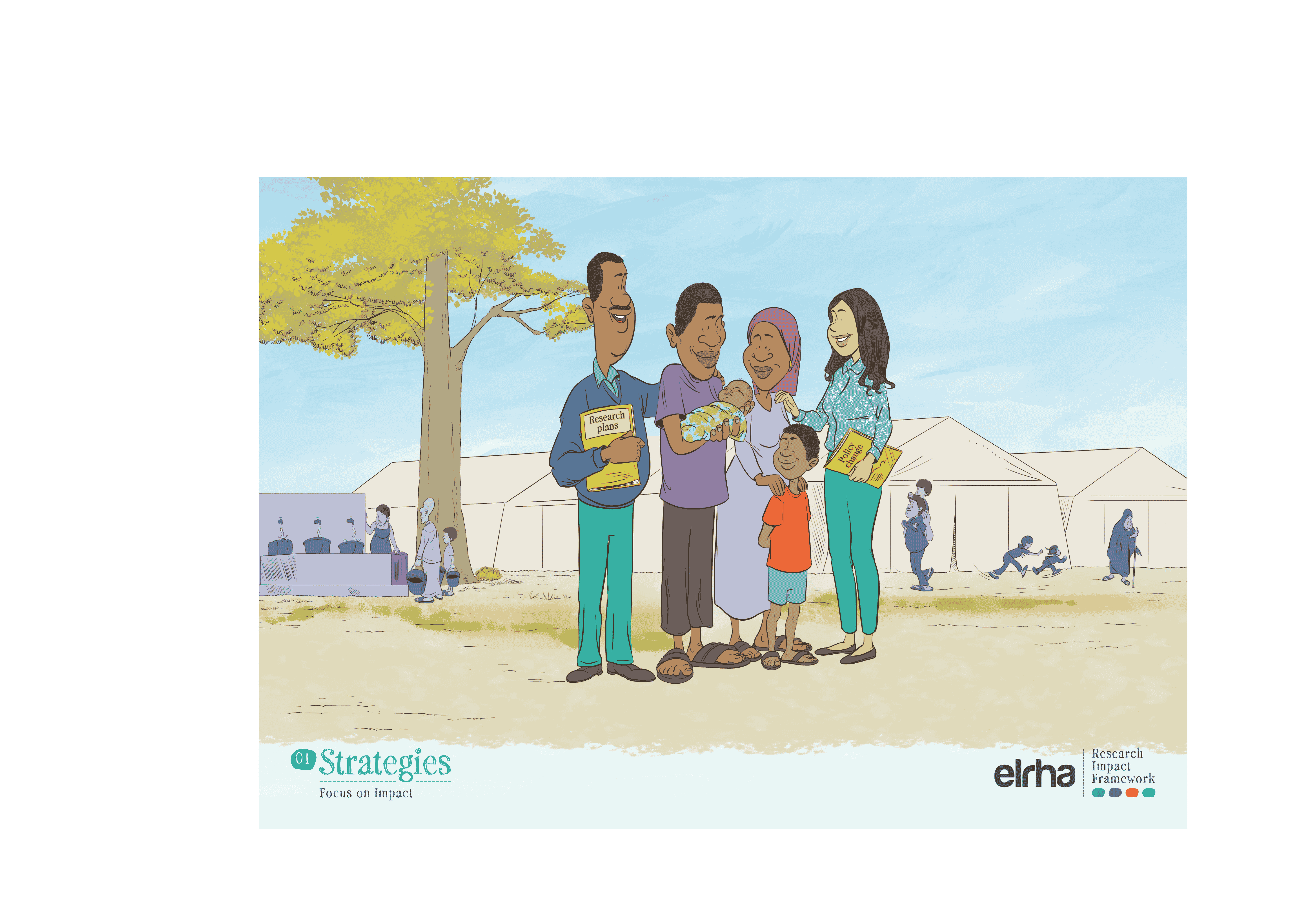
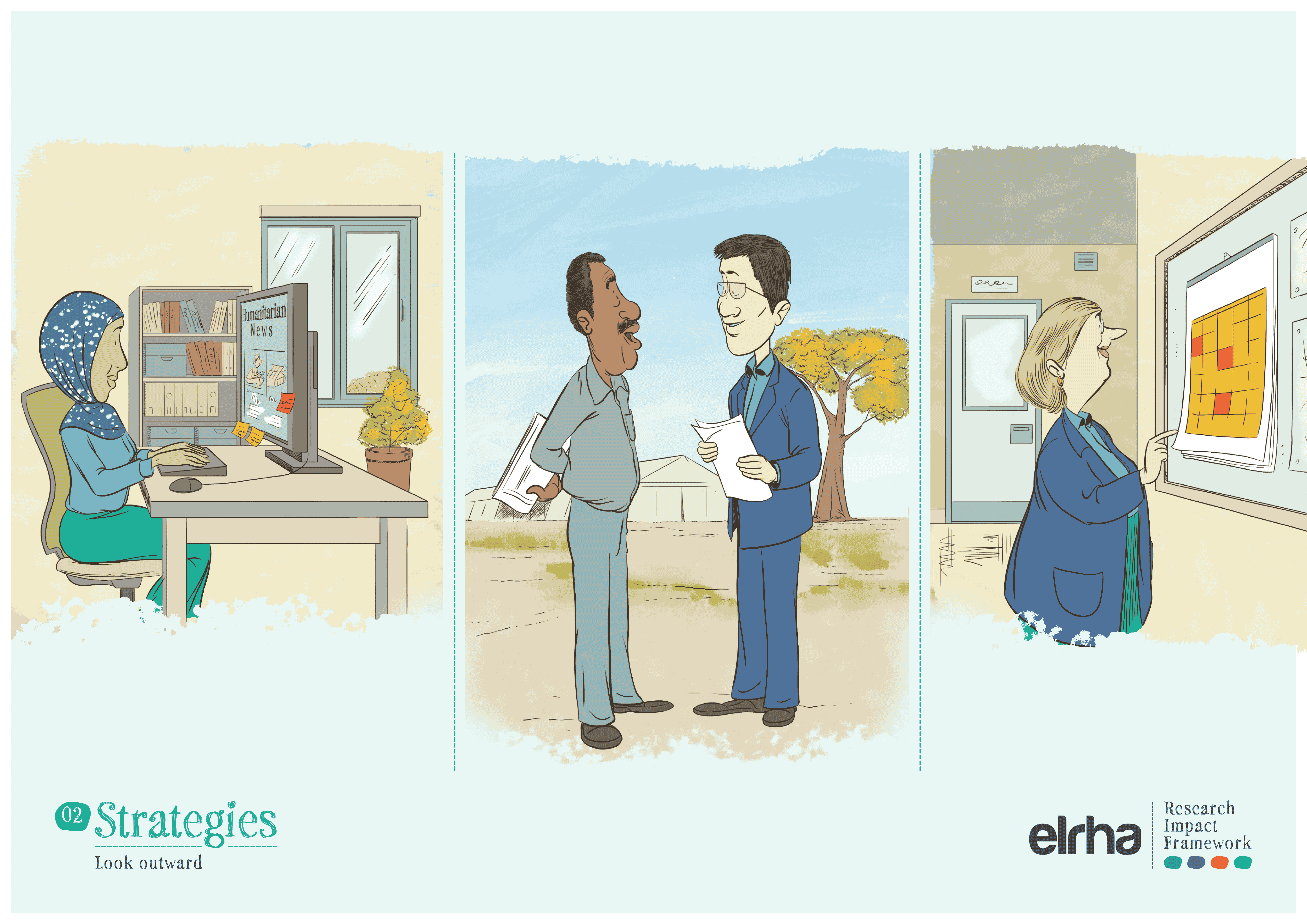
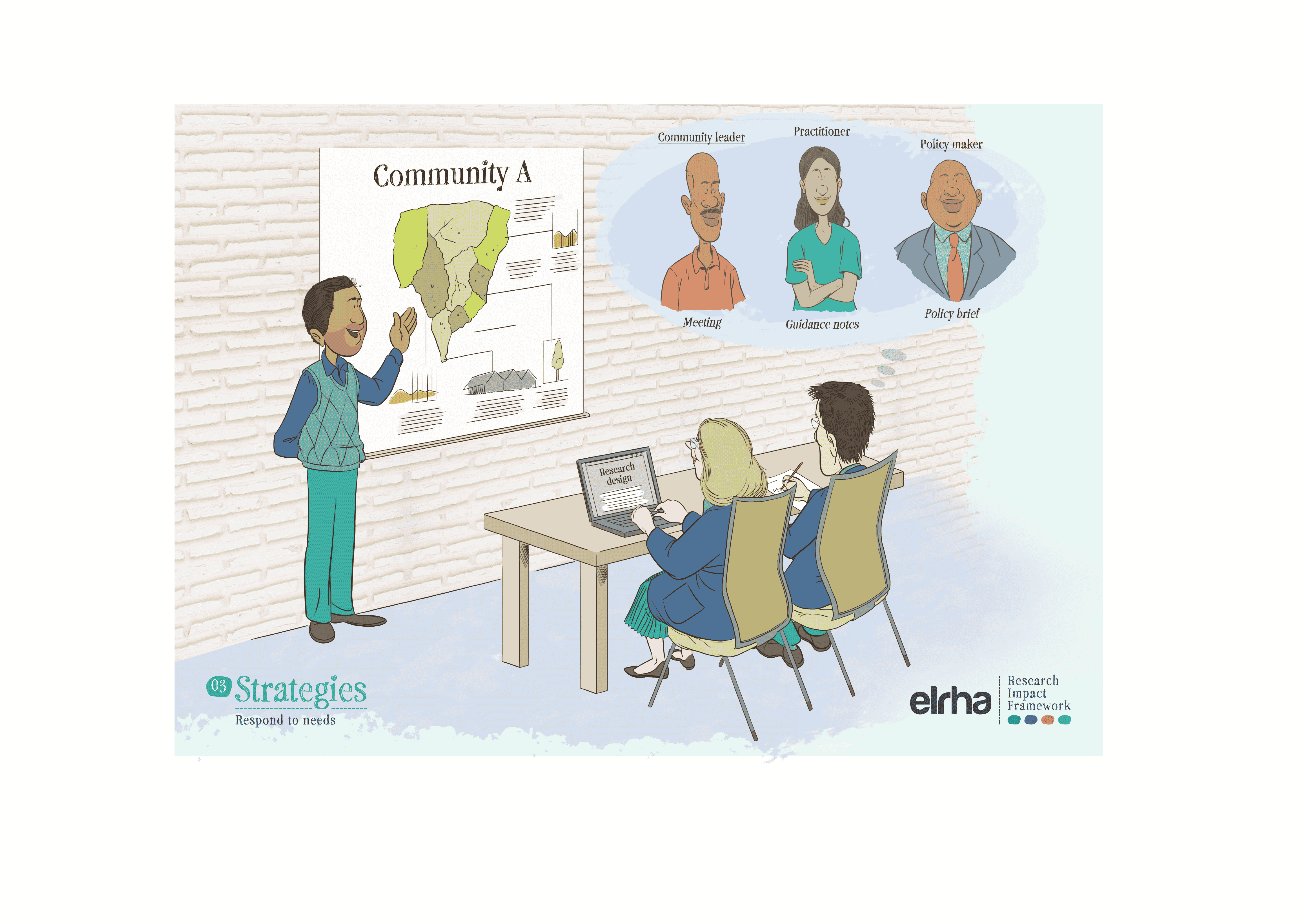
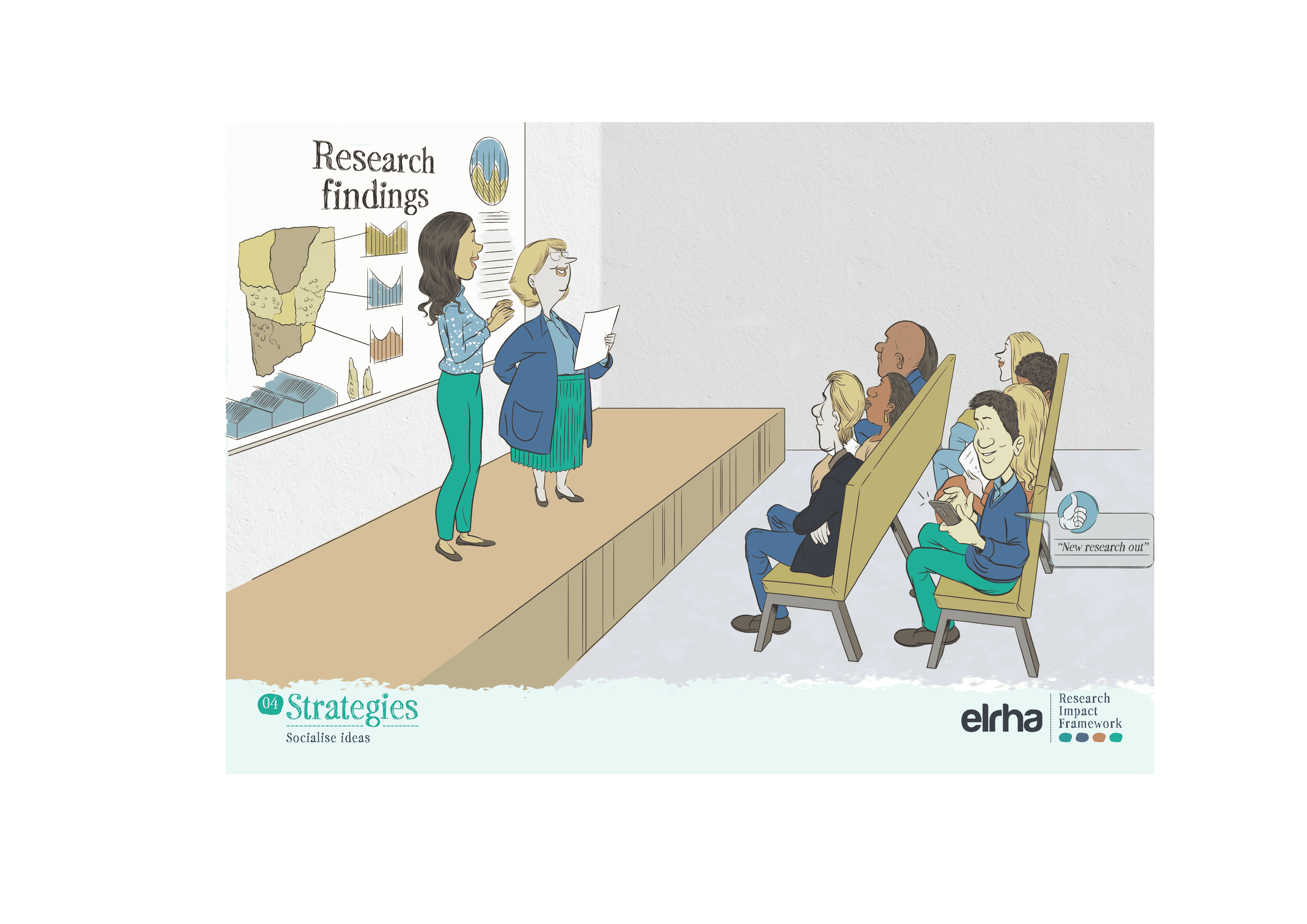
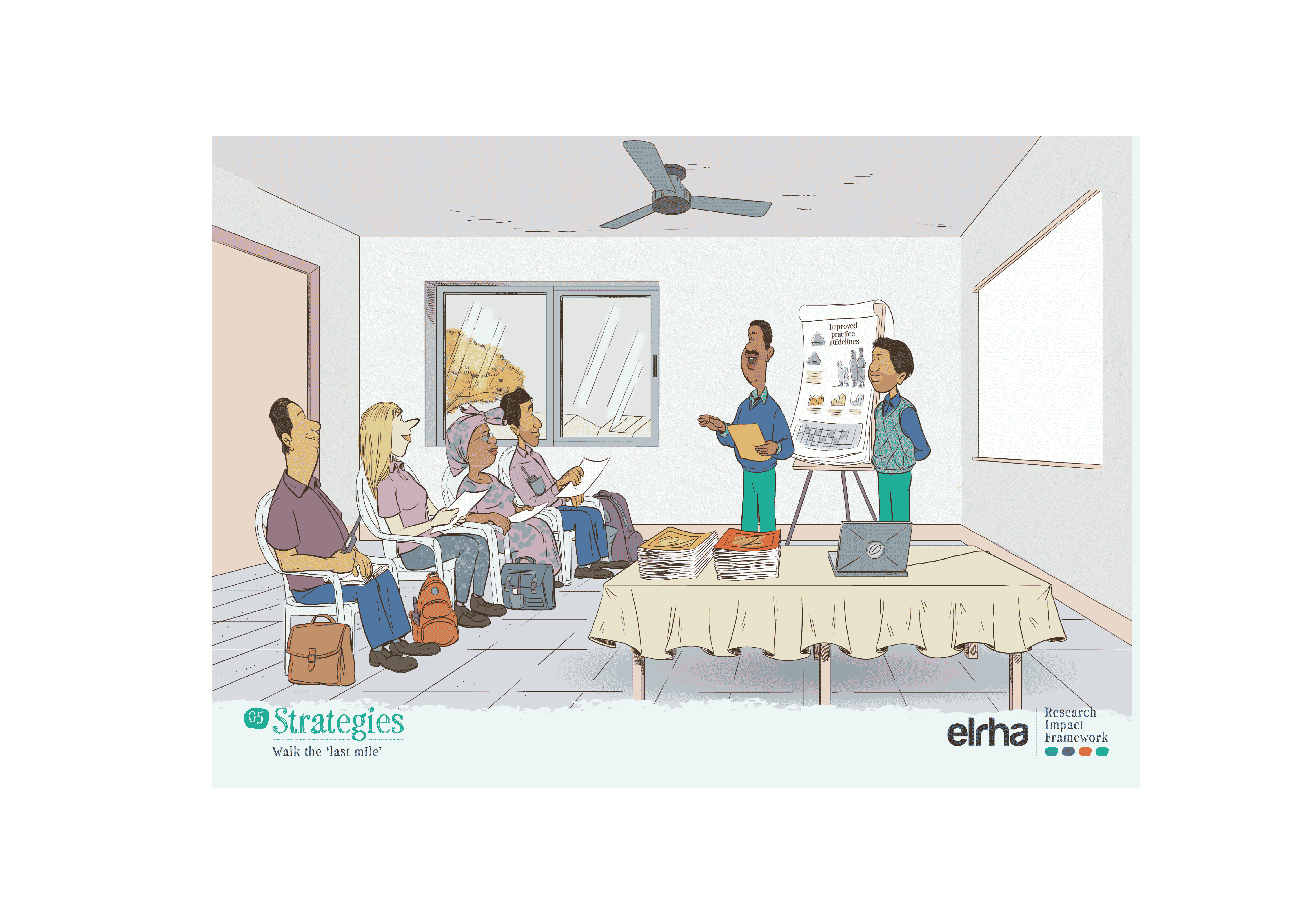
That is why a systems-focused resource like the Research Impact Framework benefited from illustration. The Framework provides guidance on how humanitarian health research can better influence policy and practice. It sets out five strategies and nine enabling conditions that shape impact. Useful, yes, but still abstract when presented only as text or a diagram. Ahead of the Research Forum in Nairobi in 2025, we worked with an East African illustrator to translate those strategies and enablers into a set of illustrated scenes. The choice of collaborator mattered. If “shifting the power” is a serious commitment, it has to show up not only in who gets invited to speak, but in whose visual language we use to explain the work.
The difference in the room was immediate. People stopped. They pointed. They debated what an image meant. They took photos and shared them. Importantly, the images gave people a way to talk about the Framework without needing to quote it. That is often the moment an idea moves from “interesting” to “usable”.
Cartoons will not fix the politics of evidence, or the constraints of crisis response. But they can help ideas travel through the messy pathway that From knowing to doing describes: through champions, brokers, guidance, training, and finally into practice. And at a time when every team is being asked to cut costs and show impact, it is worth paying attention to tools that are quick to absorb, easy to share, and good at carrying the truth. Sometimes the most useful thing a communicator can do is give an idea a shape people can remember.
Find out more
Explore the research impact framework, illustration and briefing note. You can also learn more about the 2025 Humanitarian Health Research Forum.
.png)
No items found.
Stay updated
Sign up for our newsletter to receive regular updates on resources, news, and insights like this. Don’t miss out on important information that can help you stay informed and engaged.

Related articles
all latest news


Explore Elrha
Learn more about our mission, the organisations we support, and the resources we provide to drive research and innovation in humanitarian response.